This brief tutorial continues from ArcGIS Online Joining tutorial where attributes from a CSV were joined with points on the map. Here, we will create a visualization reflecting the diameter at breast height and tree species.
In preparation for this tutorial, you will need an organizational account with Esri. If you are a Brock user, you will sign into the software using your Brock credentials and the organization’s URL brock.maps.arcgis.com.
The Scenario
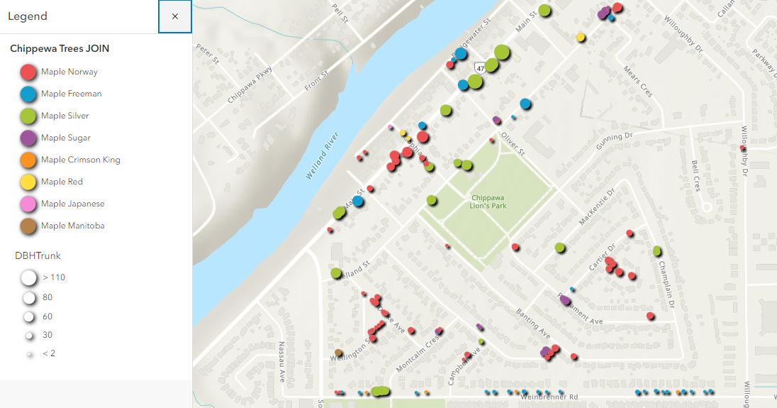
We will be mapping tree sample data for the neighbourhood of Bridgewater near Niagara Falls and Chippawa. Tabular data was joined with the geospatial data creating a powerful connection that will allow us to visualize attributes such as diameter at breast height (DBH) and tree species. Although this example uses point data, the same general steps could apply to boundary files such as census tracts or municipal boundaries and associated tabular data.
In some respects, visualization in ArcGIS Online offers more options and simpler workflows than the desktop version (ArcGIS Pro). Continue this tutorial to learn more.
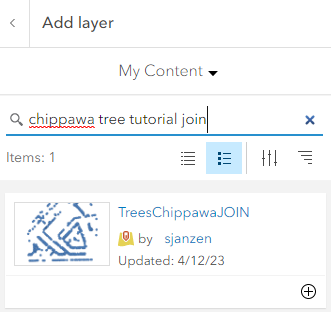
Enter the keywords “Chippawa tree JOIN tutorial” and click the plus sign to add the layer to your map. Alternately, you can add the file created in a previous tutorial (TreeDataChippawa).
Applying a Filter
To start off, we will filter out the species of trees that include ‘maple’ in the species description.
 . The Filter dialogue box appears.
Click 
From the dropdown options, create the following condition:
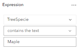
Click Save.
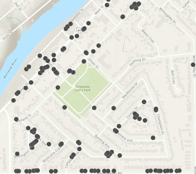
The map now shows all trees that contain the word ‘Maple’ in the species description. (NOTE: use a capital “M” in “Maple”)
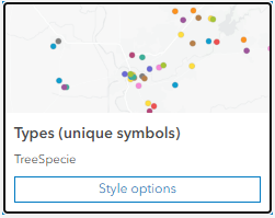
Symbols
 from the menu to the right.
 then select the field to map, in this case, select TreeSpecies. Click Add.
 again and select DBHTrunk. Click Add. The symbols are updated with colours representing species and proportional symbols representing diameter.
Click style options for unique symbols.
For Outline Colour, select the black option. 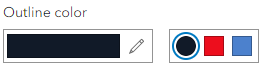
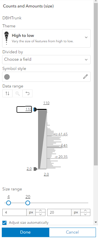
Click Done then click the Counts and Amounts style options.
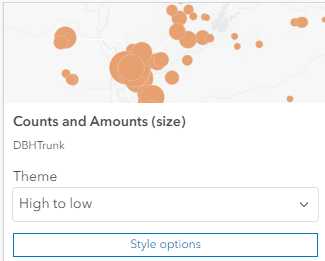
Scroll, if necessary, and change the upper size range to 20.
 .
.Toggle on the Drop Shadow option.
Click  to view the legend.